Harmoney
–
Harmoney –
Project Type
IOS Mobile App
Role
Lead Product Designer
Agency
Solo Freelance
Timeline
4 Months (Part Time)
The
Problem
How do you design a 0-1 music rights marketplace app that meets business goals, inspires trust with new users, and eliminates purchase friction?
Harmoney is a digital startup that offers a straightforward marketplace to buy and sell shares of music royalty rights. The founders came to me to design the app in order to help them secure their next round of VC funding, at which point the app would be developed.
First things first – what are the main business goals?
After some initial workshopping with the founders, we landed on 3 key business goals for the app.
Time to chat – who are the users?
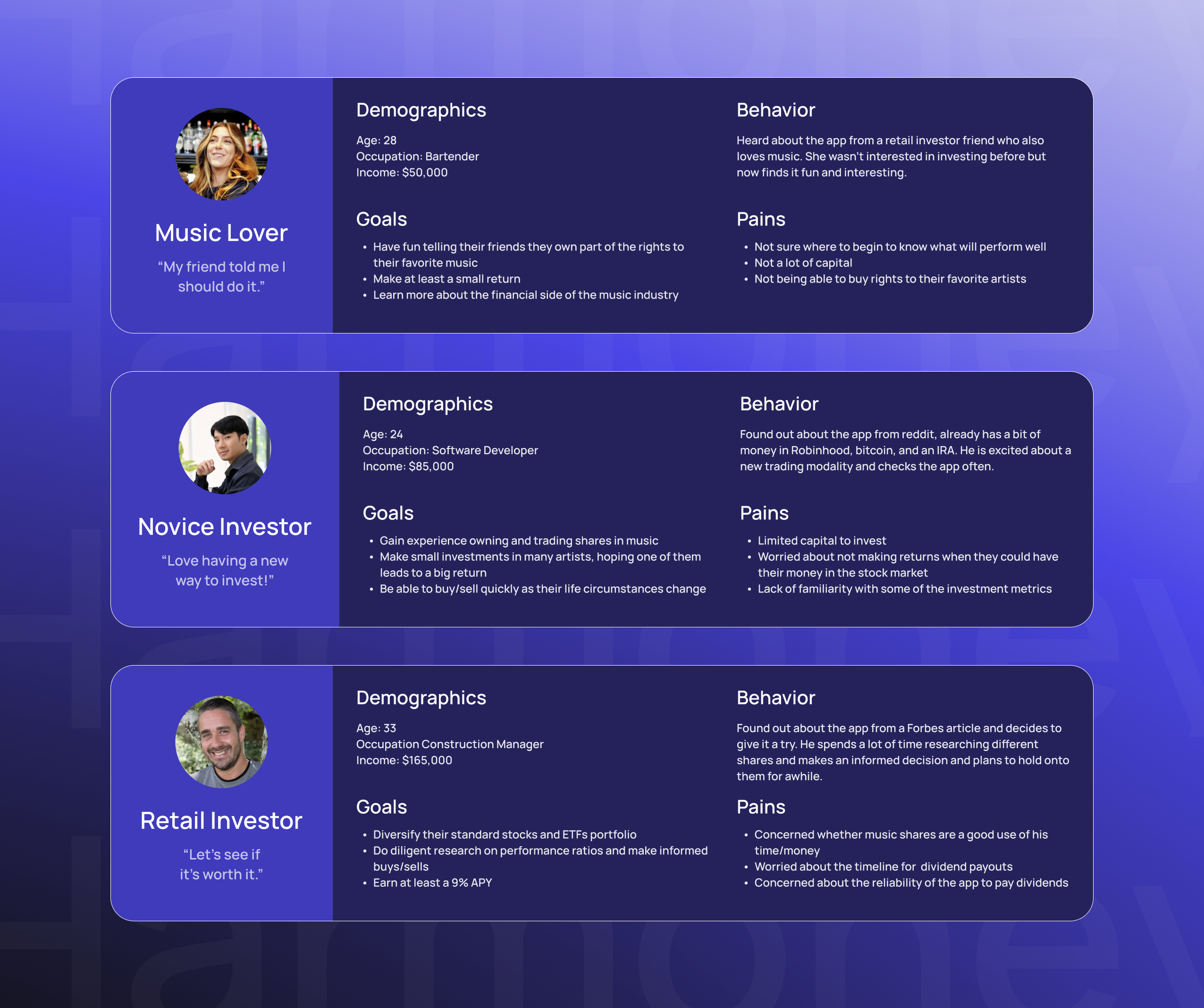
The founders had a pre-launch email list, and I sent out a survey to that list to find a good sample size of users to speak to. After analyzing the survey data and speaking with several users, I was able to form the user personas.
Surprising insight – the most common persona had ZERO investing experience.
Shockingly, this was news to the founders. They had originally been targeting more seasoned investors as their main audience. The main takeaway from this insight is that “content > financial stats.” Being able to offer music rights for beloved and popular songs just might be a lot more valuable to Harmoney than being able to load up their marketplace with more obscure songs that delivered better dividend returns.
How do you design an investment app for “groovy noobies” while also appealing to more seasoned investors?
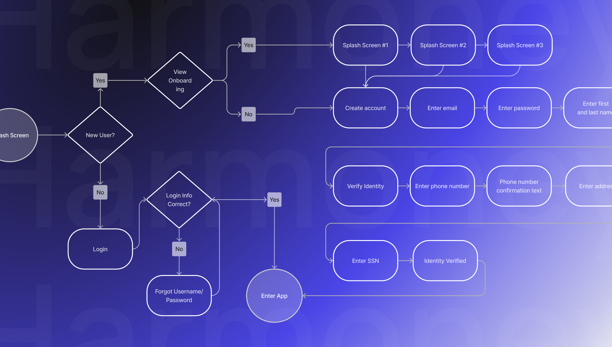
Go with the flow – Time to craft the user flows
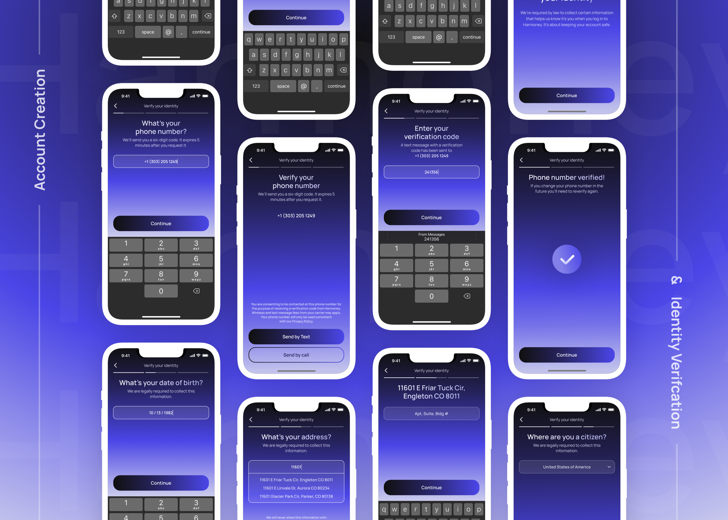
Biggest Insight – There is a lot of information that we need to gather from the users
It’s going to be important to figure out how to obtain all of the user information necessary for them to use the app while also not inundating the users with an endless barrage of information to give us. I have some ideas, and they’ll need to get fleshed out in the wireframing stage.
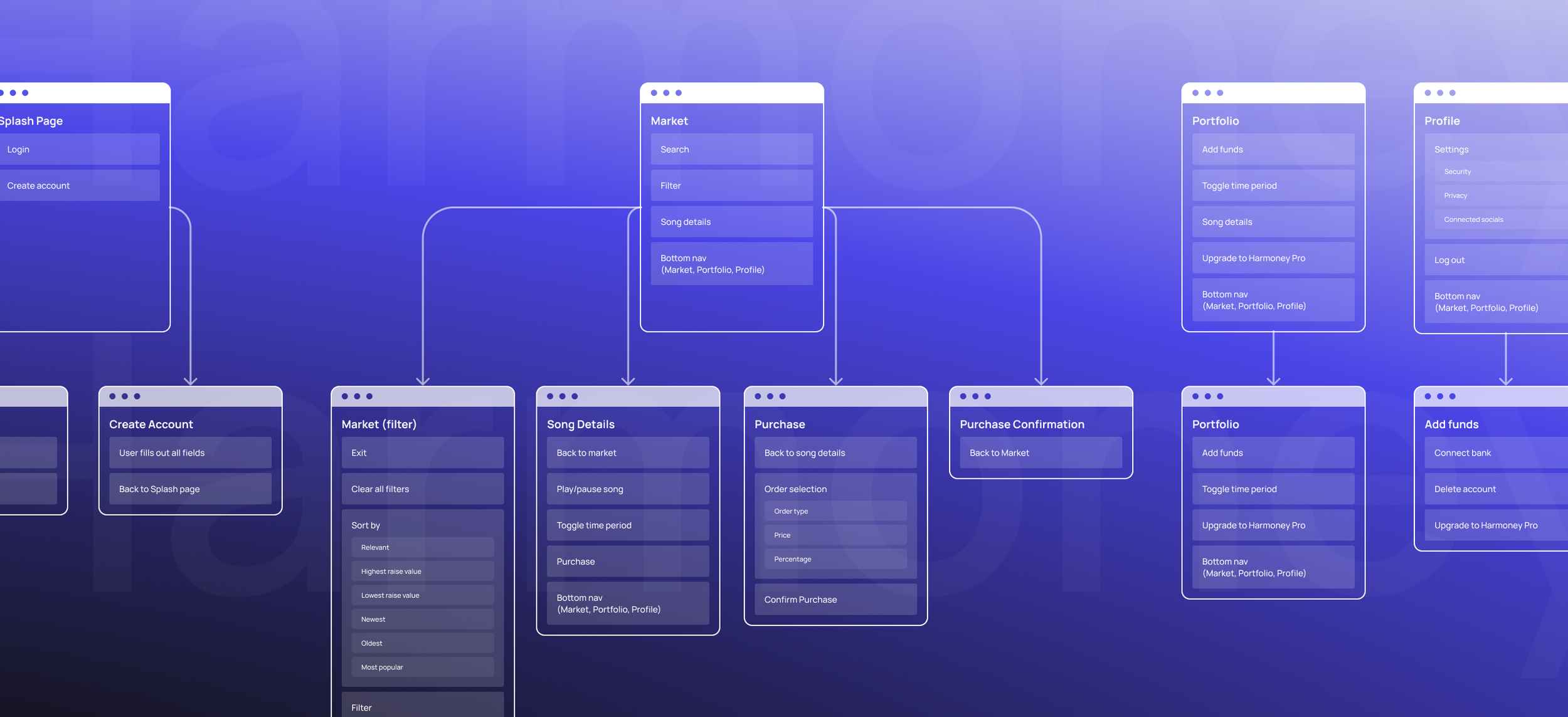
A quick sitemap to establish the IA
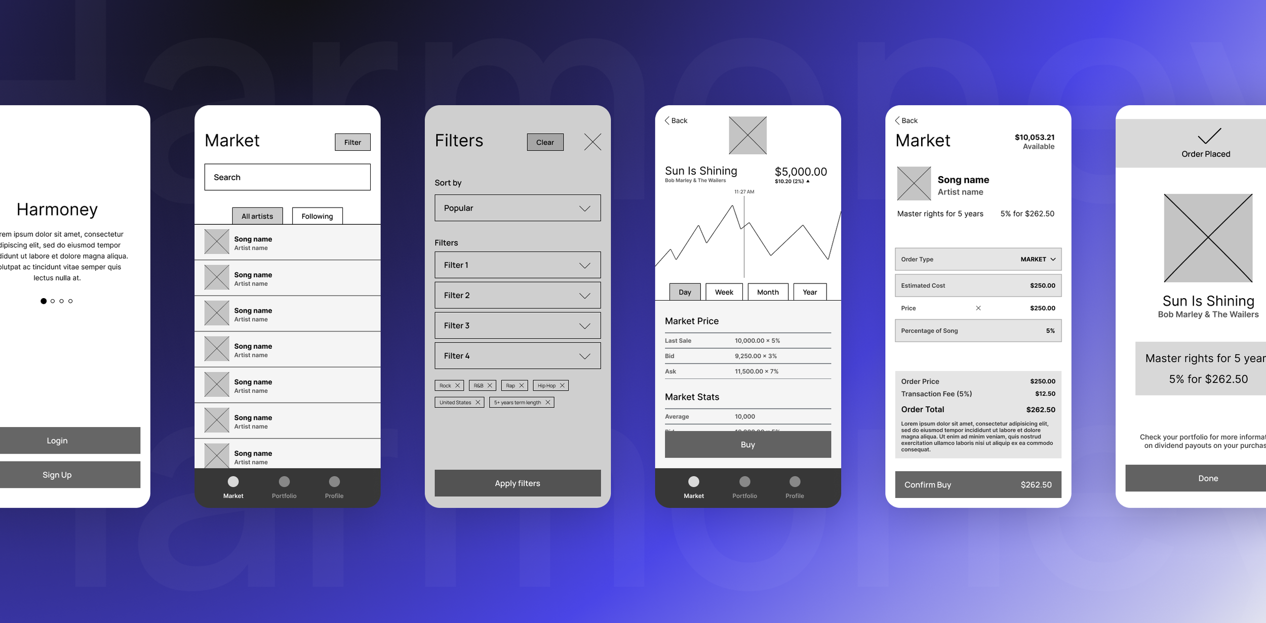
Time to Wireframe
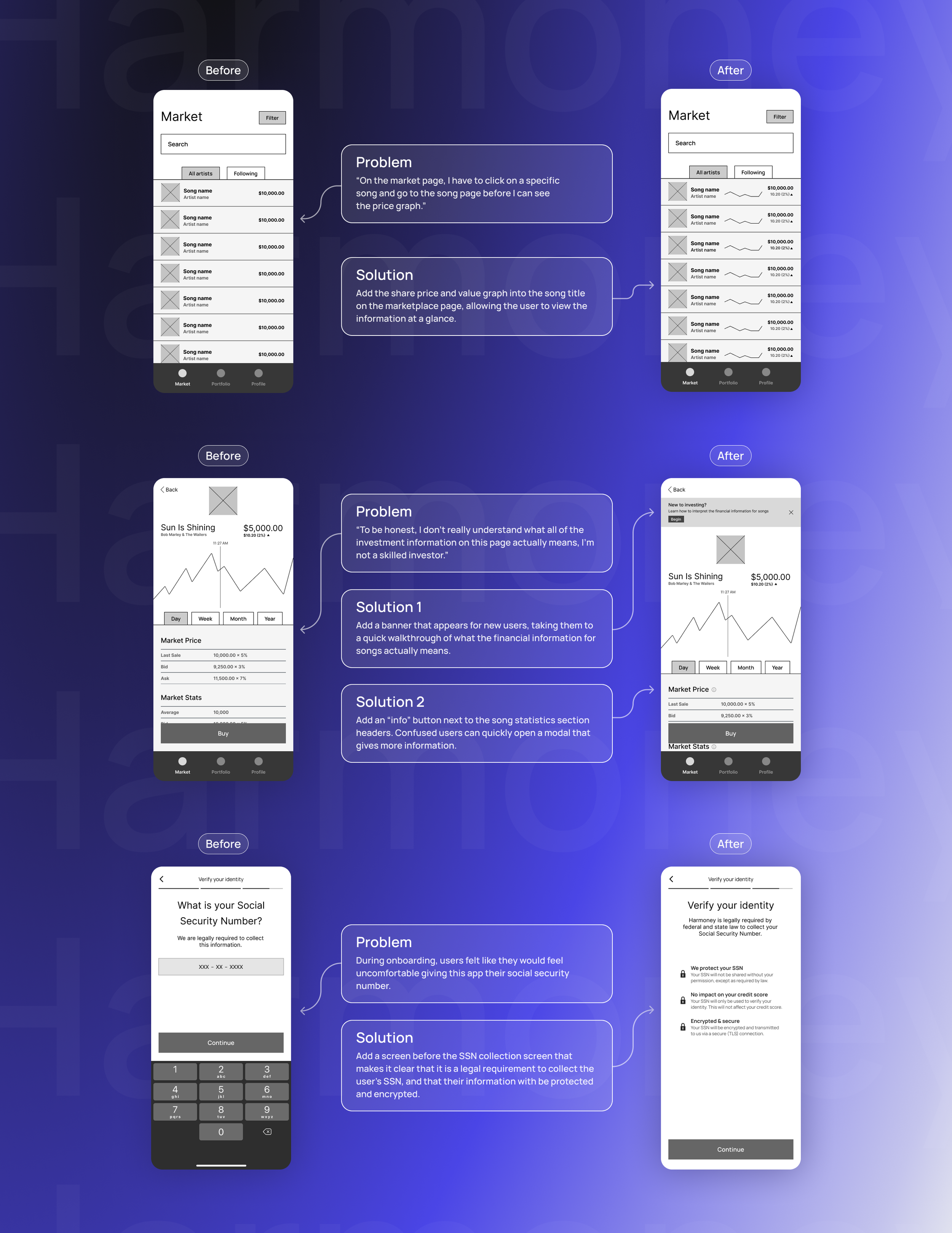
I created a first draft of wireframes and when that was ready, I quickly put it in front of some users to see what was working and what needed refinement.
User Testing Insights
Primary Insight – Simply the Purchase Screen to reduce overwhelm and illicit action
Additional Insights
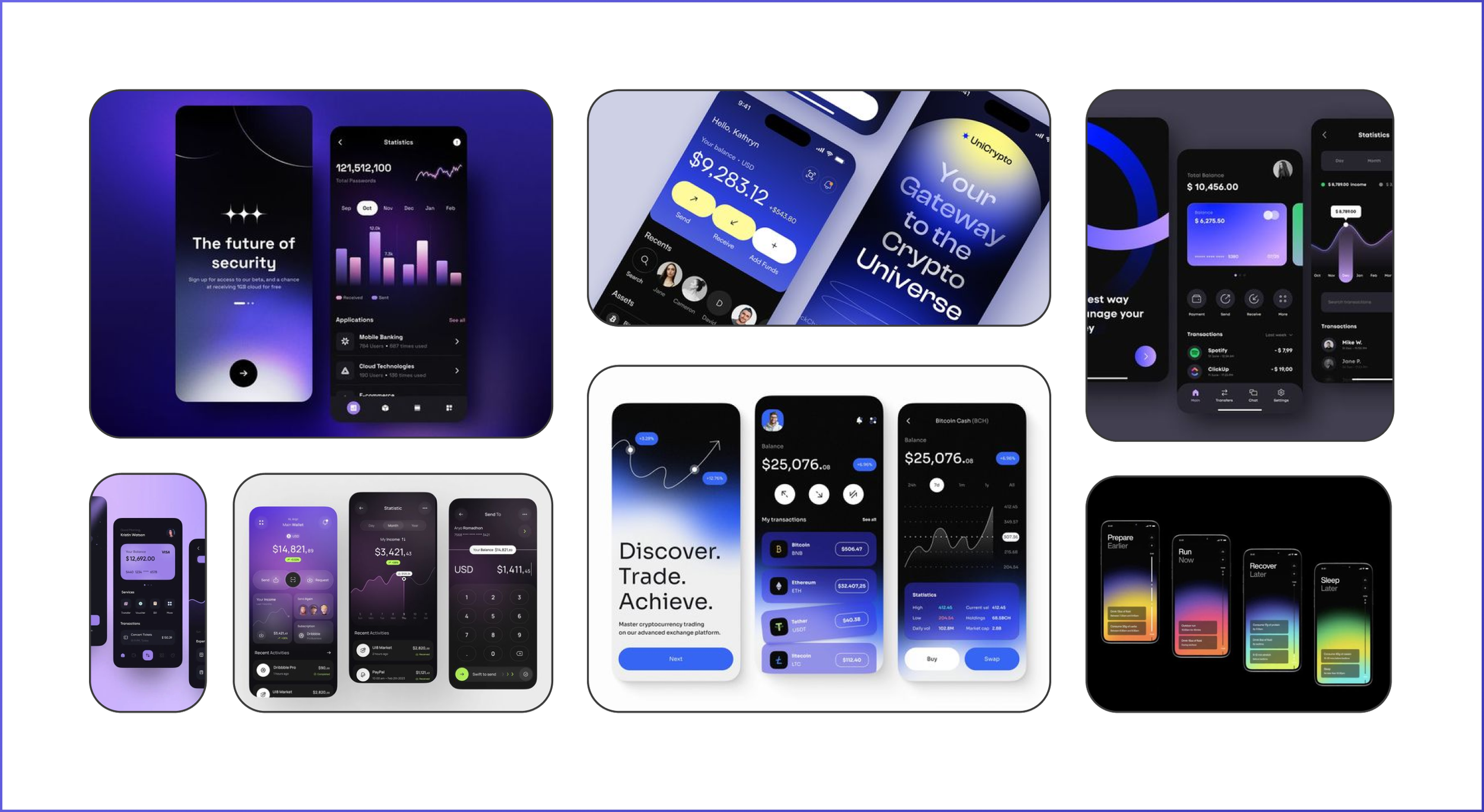
Now, how do we make it feel trusted, sleek, and innovative?
Moodboard showcasing the chosen visual direction, featuring a dark color theme, gradients to add a dynamic feel, and a blue color palette to allude to fintech.
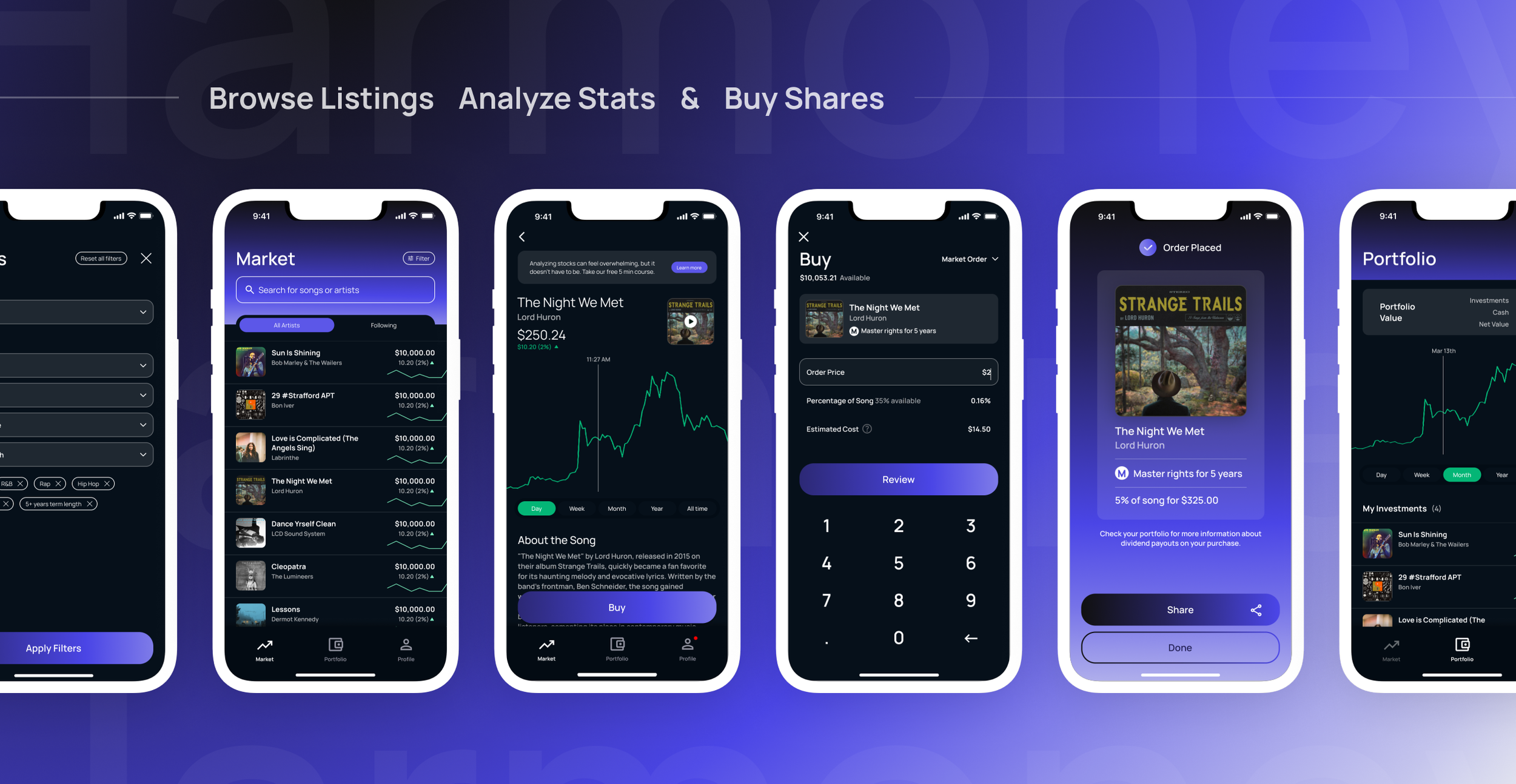
Putting the creative direction into action
App Walkthrough
What I learned
This was a rather unique project for me, as I was working as a solo freelancer directly with the client. Normally I work in conjunction with a design studio or agency. It was a challenge to not have another set of eyes on the project, or anyone to bounce ideas off of, but it was also an opportunity to step into other roles that I don’t spend as much time in, like creative direction.
One crucial learning for me was that it was very important for me to understand, in very granular detail, exactly how the financial and trading aspects of the marketplace worked. As I started on wireframes, I realized that I had some misunderstandings about the functionality, which caused me to have to backtrack and refactor some of the pages. Overall it was a minor setback, but it gave me a deeper desire to make a point of understanding the client’s business in detail in the beginning of the process, rather than making assumptions and asking questions later.
Credits
Jackson Montgomery (Development Feasibility Advisor)


