
Avail
–
Avail –
Project Type
0–1 Web App
Role
Lead Product Designer
Agency
Solo Freelance
Timeline
8 Months (Part Time)
The
Problem
How do you consolidate a chaotic business workflow and turn it into a comprehensive 0-1 SaaS product?
A Coca-Cola maintenance subcontracting company came to me needing a custom software solution for their day to day operations workflow.
MK Beverage is a Coca-Cola subcontractor that services high-tech soda dispensers for restaurant franchise locations across multiple U.S. territories. Operating at high volume and speed, their business depends on accurate, centralized information to track each repair from intake to completion.
Although the platform was built in close partnership with MK Beverage, it was intentionally designed as a standalone SaaS product. Ownership of the application remained independent after delivery, enabling it to be licensed to other subcontractors within the same industry. This product-first approach is reflected in the name Avail, rather than a client-branded solution.
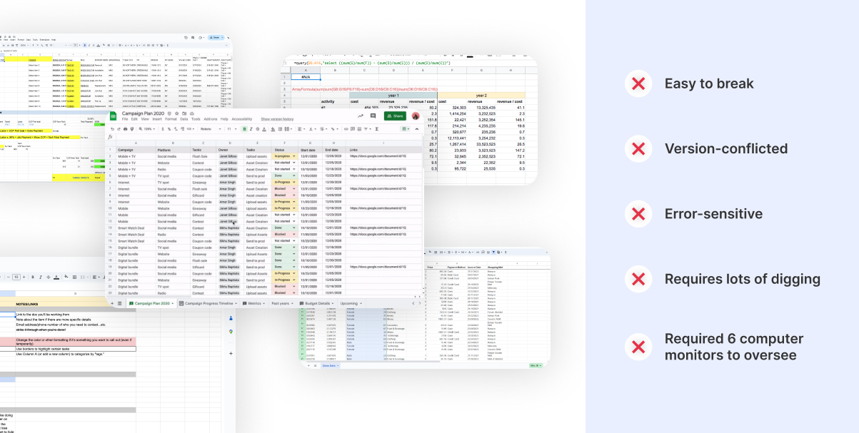
Hundreds of monthly work orders. 40 different spreadsheets. No single system.
The client currently relied on over 40 different spreadsheets to manage work orders across multiple territories throughout their lifecycle. Information was spread across documents owned by different roles, requiring constant manual updates and cross-checking to understand the true status of a job. While this approach technically worked, it created fragmentation, limited visibility, and increased the risk of errors as volume and complexity grew.
Couldn’t this be solved with more organized spreadsheets?
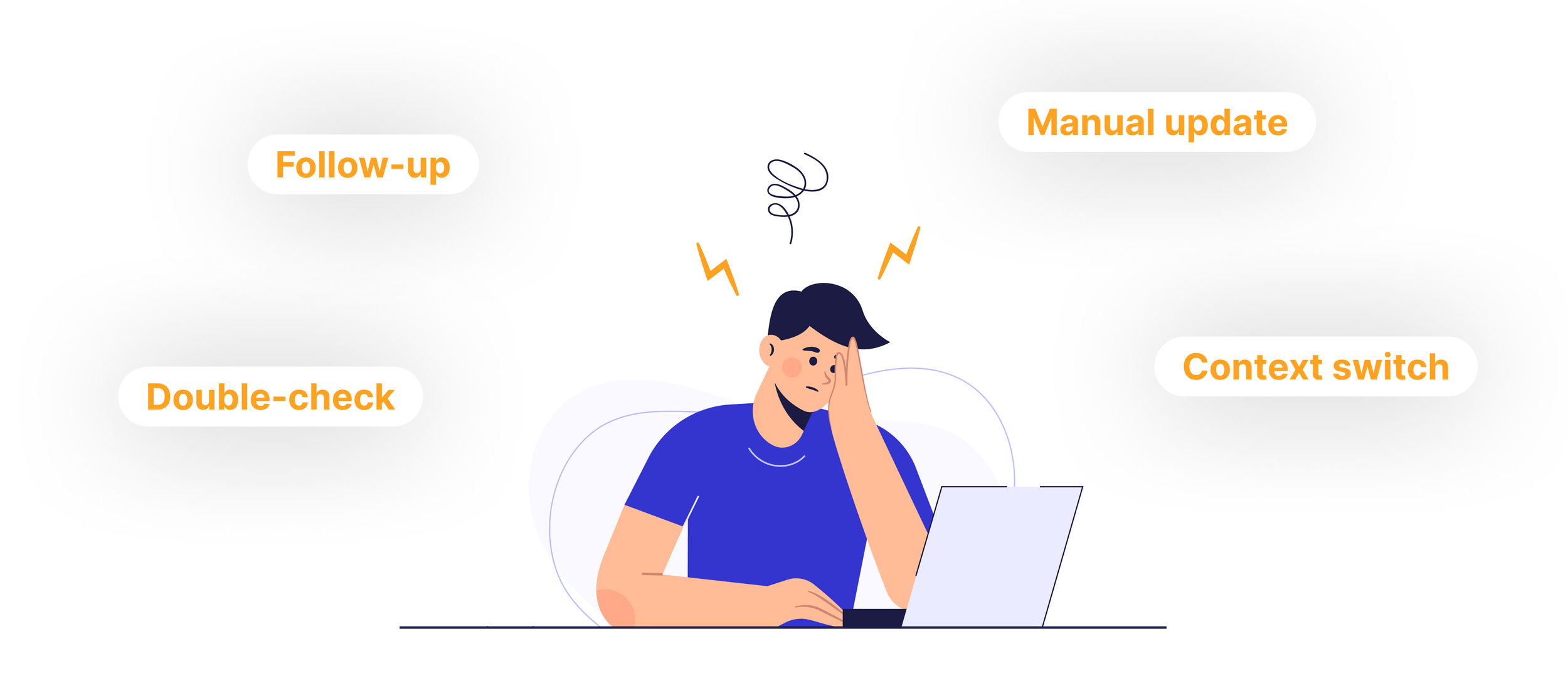
At a glance, the problem appeared to be a collection of messy spreadsheets. But the underlying issue ran deeper. The workflow relied heavily on manual coordination, company knowledge, and constant context-switching across disconnected tools.
Incremental improvements, such as reorganizing spreadsheets or adding stricter conventions, would have reduced surface-level friction but failed to address the core risk: there was no single system responsible for maintaining clarity, accuracy, and continuity across the operation.
The challenge wasn’t replacing spreadsheets. It was replacing the invisible work happening between them.
Time to turn their complex, scattered workflow into intuitive powerful software that everyone can use and everyone can trust.
The client had never built software before, so instead of asking what they wanted to build we focused on understanding how the business actually operated day to day.
Early on, the client attempted to define features and interface ideas, despite not yet having a full picture of what the system needed to support. Rather than locking in assumptions too quickly, we shifted the conversation toward understanding how work actually flowed through the business. By walking through real scenarios from intake to completion, we uncovered the underlying structure the software needed to reflect. (Talk about this process consisted of interviews with Ken and his staff. As well as video recordings of their current workflow.)
Insight 1 – Even the “happy path” was complex, multi-step, and required coordination across all 5 roles in the team.
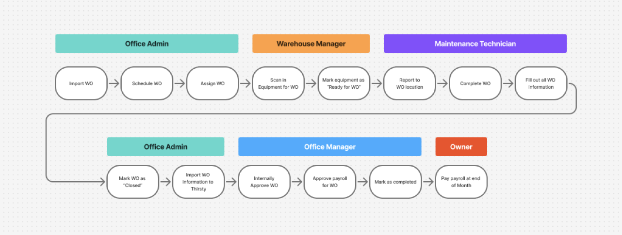
Even the ideal workflow required coordination across five different roles. Jobs moved from scheduling, to field execution, to administrative review, to external submission and payment processing. Because each step depended on accurate handoffs and timely updates, the system needed to support clarity, accountability, and shared visibility at every stage.
Insight 2 – Core features needed to support many real-world variations
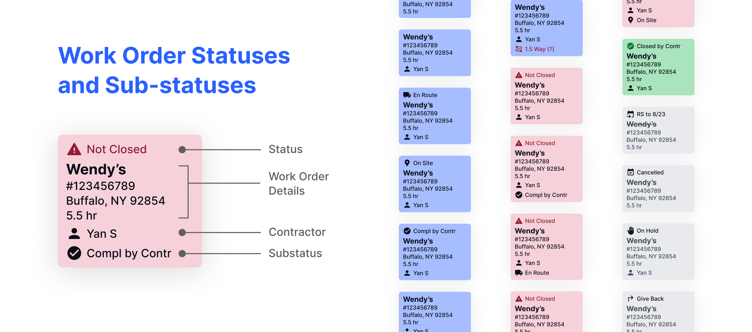
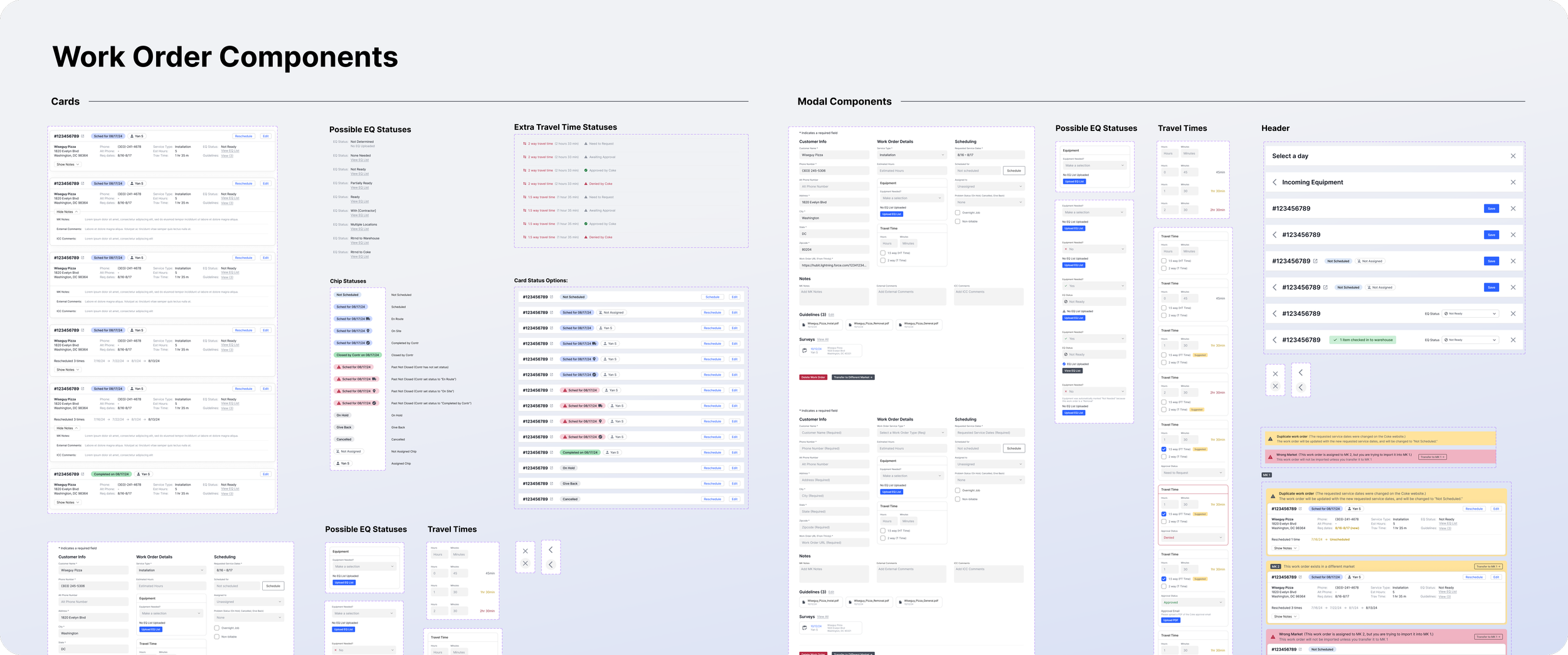
While the product was built around a small set of core features, each one needed to support many real-world variations. Work orders moved through different statuses, required different inputs at different stages, and followed different paths depending on approvals, timing, and downstream dependencies. These variations weren’t exceptions. They were fundamental to how the business actually operated, and needed to be designed into the system from the start.
Insight 3 – Some of the different roles required fundamentally different experiences
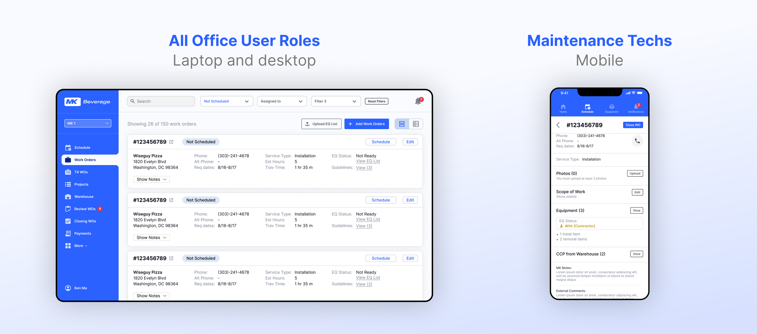
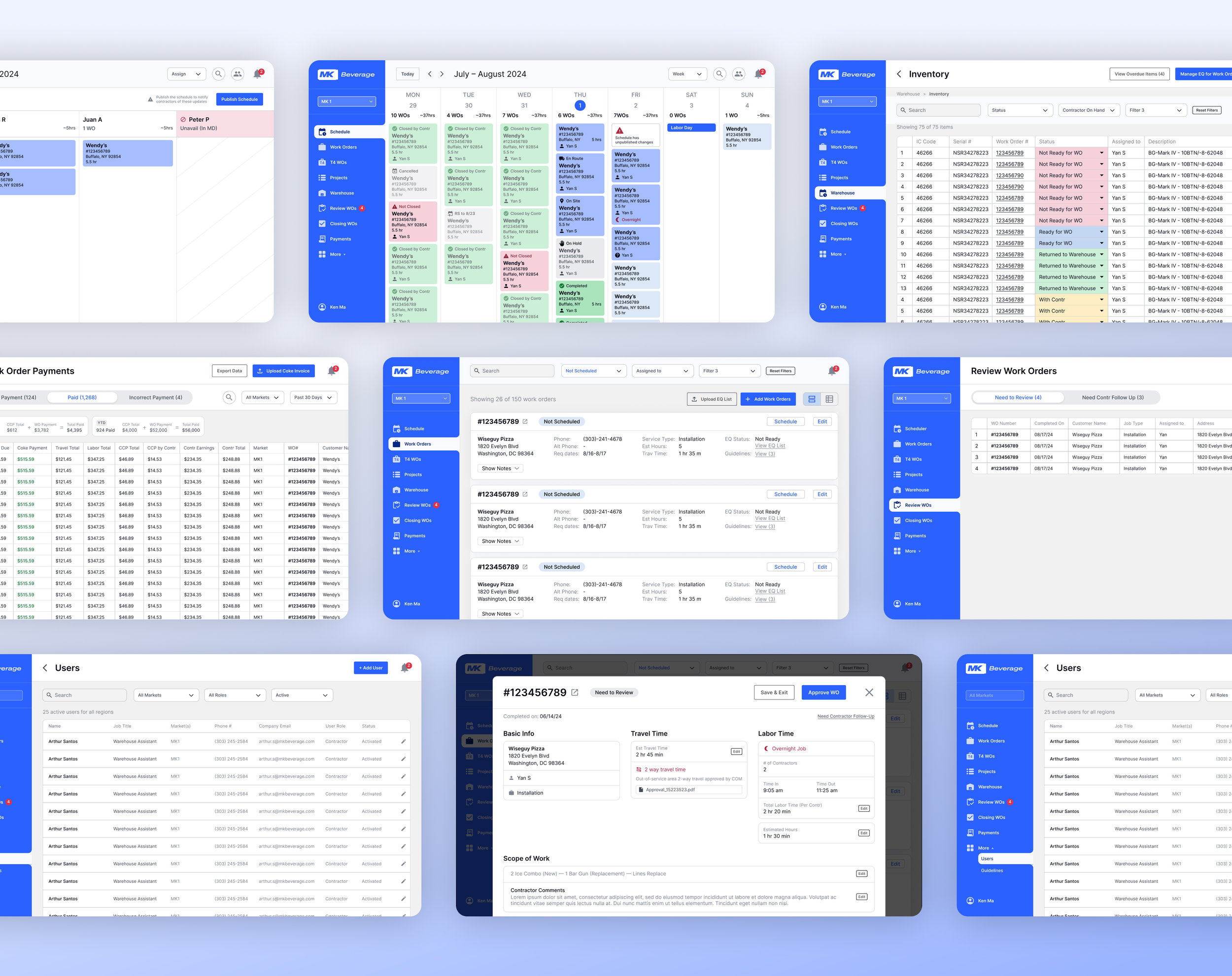
Office staff worked primarily from desktops and laptops, often on shared screens and monitors, and needed broad visibility into the system. While permissions controlled what each role could act on, the underlying interface remained consistent across office users to support collaboration and shared understanding.
Service technicians, however, interacted with the system exclusively from their phones while working in the field. Their needs, constraints, and environment were fundamentally different. This required a distinct, purpose-built experience optimized for speed, clarity, and ease of use on mobile rather than a scaled-down version of the desktop interface.
Using wireframes to pressure-test understanding of the workflows and functionality
Even with a solid understanding of the overall workflow, there was significant nuance in deciding what information to show, when to show it, and how much was needed at each step.
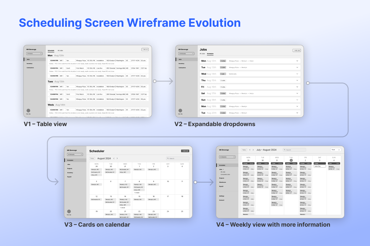
The work order scheduling experience evolved quickly as we tested it against real planning scenarios. Early concepts explored simple date-based views and collapsible groupings that made work orders easy to scan at a glance. As we walked through actual scheduling decisions, it became clear that this approach lacked the context needed to balance workload and availability. The design ultimately settled into a calendar-based model, refined into a week view that surfaced the specific information required to make confident scheduling decisions.
Refining usability through hands-on walkthroughs and Figma prototype links
Walking through flows and sharing interactive Figma prototypes with the client allowed us to test usability in context, uncover friction points, and iterate quickly. These hands-on sessions helped ensure the system felt intuitive to use before moving into development.
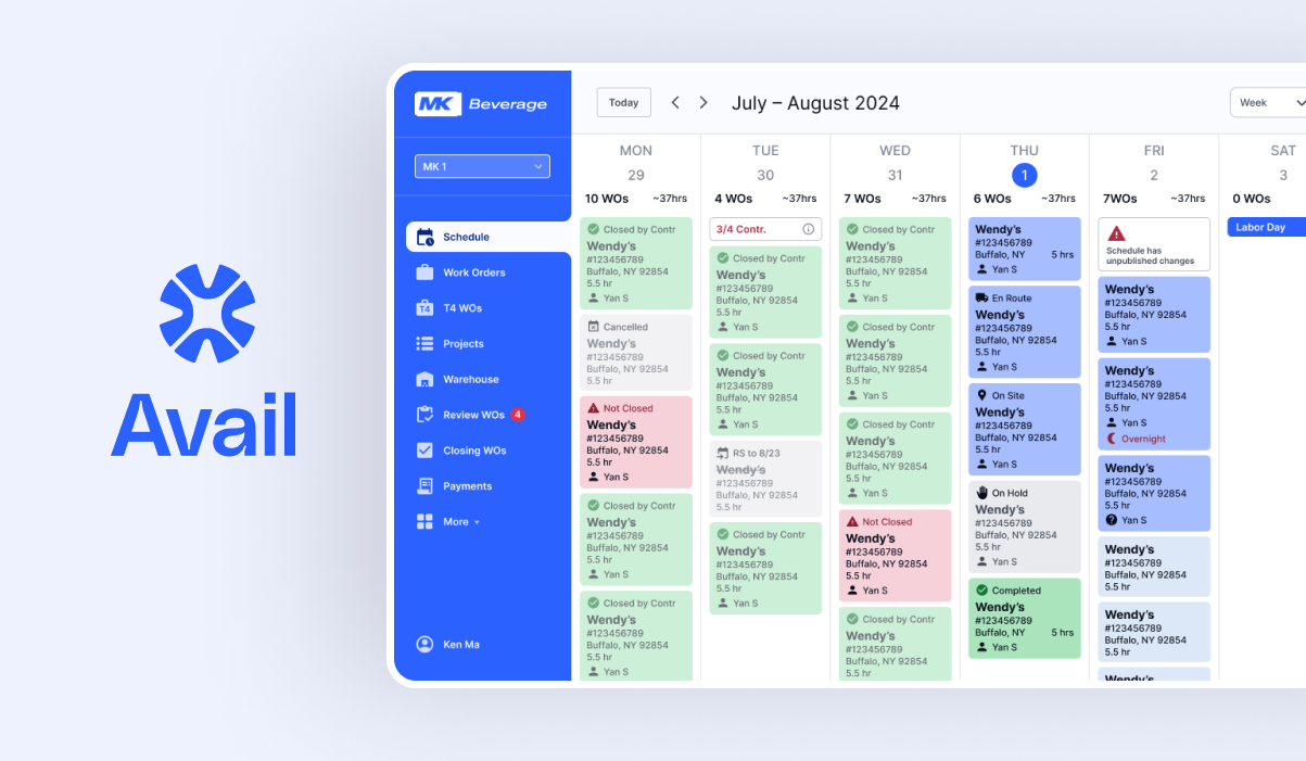
The final solution
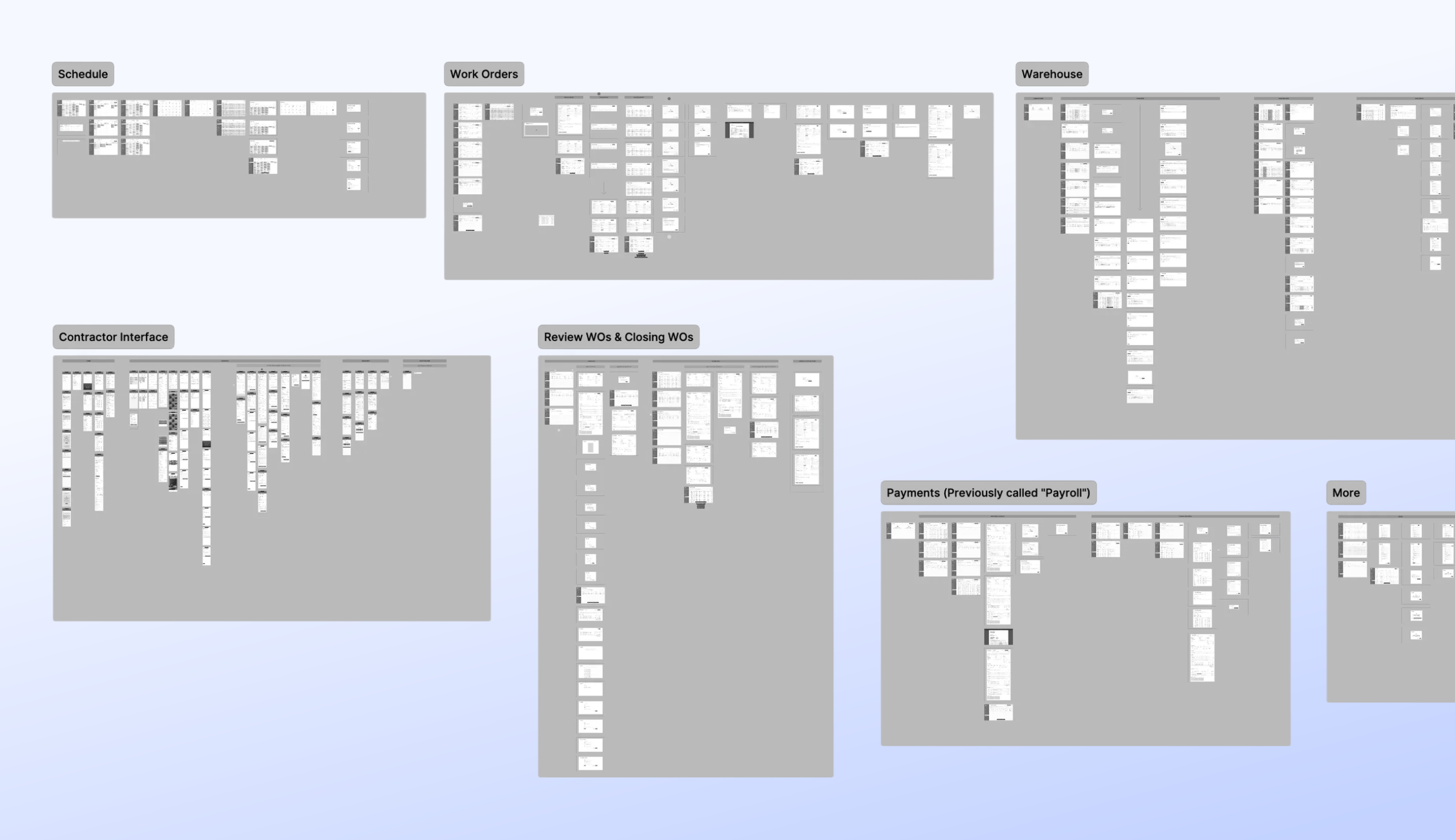
A SSoT platform where employees can manage work orders from inception to completion. 357 screens, 7 tabs, role-level permissions, mobile design for techs.
Translating validated flows into a clean, intuitive interface with a focus on hierarchy and legibility
Once the core workflows had been validated through wireframes and prototype walkthroughs, the focus shifted to visual design. The interface was refined to improve clarity, hierarchy, and usability, while preserving the underlying structure that had already been proven to work. Visual decisions were made in service of the workflow, ensuring the final UI reinforced understanding rather than introducing new complexity.
To manage complexity at this scale, the interface relied on a structured design system and reusable components.
Results
Development of this project has been delayed due to the import tariffs drastically altering the client’s business model.
The client expected that the platform would:
• Reduce time spent on payroll by 90%
• Significantly reduce the amount of overdue work orders
• Significantly decrease onboarding and training for new office admins
• Significantly reduce management oversight in day-to-day operations
• Reduce errors and improve communications between team members
What I learned
Sometimes less design is better: a simple table interface was sometimes a much better UX than elaborately designed cards.
This project really reinforced that effective UX isn’t always about richer visuals or more expressive components. In several cases, a simple table-based layout provided clearer scanning, faster comprehension, and better support for real operational tasks than more elaborately designed card interfaces. Choosing the simplest structure that served the work led to a more usable and trustworthy system.
Even if the client describes their everyday workflow in great detail, there may still be lots of small needs that go overlooked.
In the future, I will add more questions and exploration to my discovery process to provide a more comprehensive understanding of the full scope of the client’s needs. That being said, iterative processes exist for a reason, and sometimes smaller features simply can’t surface until the larger features start getting fleshed out.